Colecturia Digital is an app that functions as a digital portal for buying government-required stamps and vouchers. It simplifies the process and eliminates the need for physical visits to government offices.
What they needed
The client had already established a B2B web platform to facilitate the purchase of vouchers and stamps by professionals. However, they identified an opportunity to expand their offerings and reach a wider audience by developing an easy-to-use mobile app for regular consumers.
My tasks for this project
The task at hand was to conduct an in-depth analysis of the client’s current processes and workflows, identify any pain points or inefficiencies, and conduct UX research to determine the needs and preferences of their future audiences.

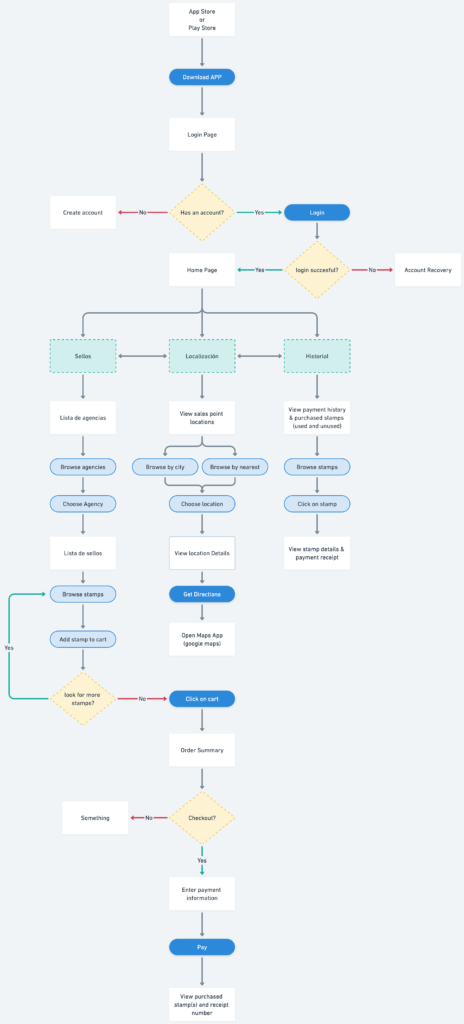
User Flow
In the case of vouchers and stamps, it was necessary to research client interactions to determine the best way to group them. This likely involved analyzing user behavior and feedback to understand how users typically search for and use these types of items.
After conducting research, the team decided to divide the vouchers and stamps by government departments. This would allow users to easily find the vouchers and stamps that are relevant to the services or programs they are interested in.
Additionally, providing a short description for each voucher or stamp would help users understand their intended use. This would be especially important for users who may not be familiar with the specific programs or services associated with each government department.
Overall, the process of developing the user flow for vouchers and stamps required careful analysis of user behavior and needs, as well as a thoughtful approach to organizing the items in a way that makes sense for users. By prioritizing user experience and providing clear descriptions, the system would be more efficient and user-friendly.
Design
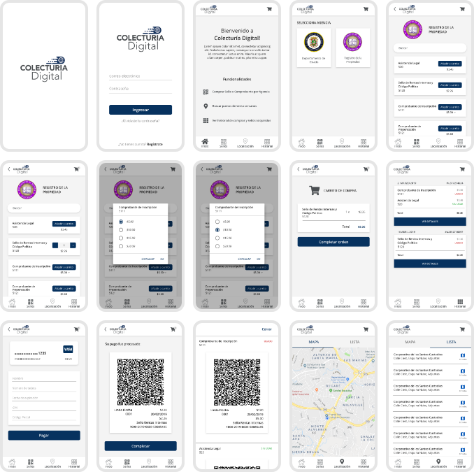
During the design phase of Colecturia Digital, we focused on creating a clean and simple interface that would be easy for users to navigate. We worked to ensure that the app was accessible and user-friendly for individuals with varying levels of technological expertise. To achieve this, we utilized clear buttons and straightforward instructions, with a streamlined layout that simplifies the process of purchasing government-required stamps and vouchers. We also conducted extensive user research and testing to identify pain points and areas for improvement, resulting in a product that eliminates the need for physical visits to government offices.

Interactive Mockup
As part of the design phase, we utilized real-life content to develop an interactive mockup for user testing. The mockup included actual government forms and documentation to ensure that the app’s design and functionality were tailored to real-world scenarios. By incorporating real-life content, we were able to identify and address any potential issues or challenges users may encounter during the purchasing process. This approach helped us refine the design and user experience, ensuring that the final product was both efficient and user-friendly. The resulting interface features clear buttons, straightforward instructions, and a streamlined layout that makes purchasing stamps and vouchers a simple and straightforward process for all users.
Results and improvements
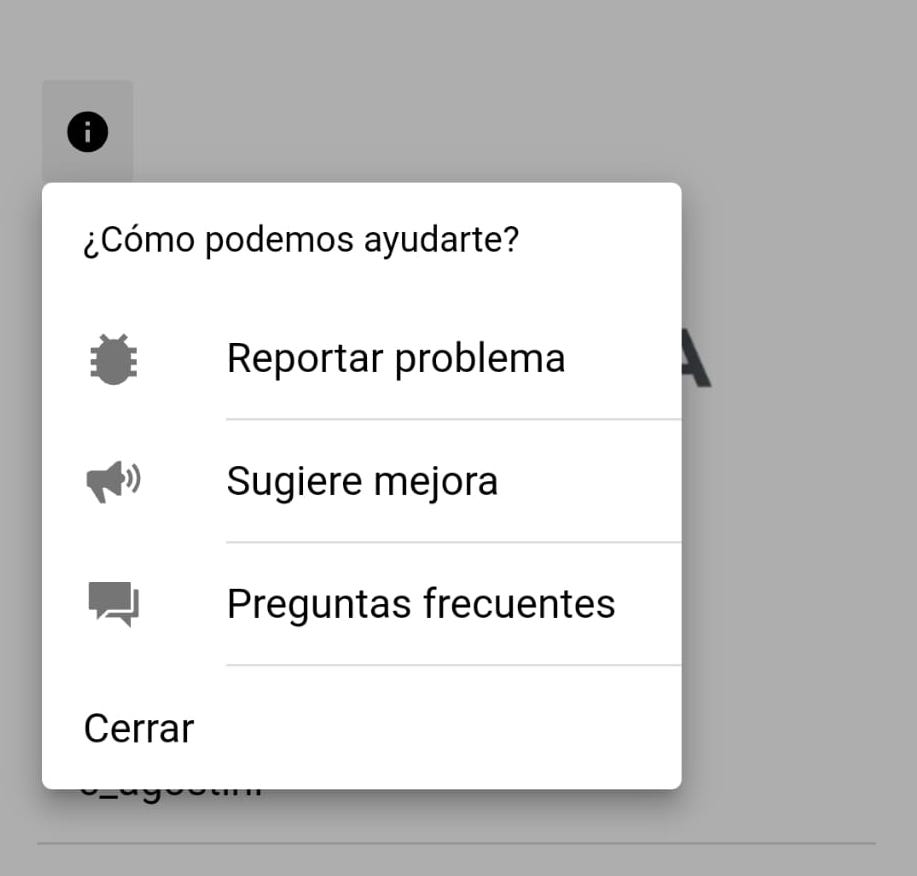
Since launching the application, we have added more types of stamps and vouchers, which has made it necessary to keep tweaking and making improvements. To further enhance the user experience, we have decided to add a section to receive direct feedback from users. This helps us better understand their needs and make necessary improvements.
