Okie Dokie is a platform designed to connect caregivers with individuals in need of care services for children, seniors, and pets in a faster and more convenient manner.
What they needed
Okie Dokie required a two-sided mobile application. One side allowed caregivers to set up their services and availability, while the other side enabled individuals in need of caregiving services to add their caregiver’s details, find, book, pay for, and manage services.
My tasks for this project
I served as the product manager, designer, and front-end developer for the project. As the product owner, I oversaw the different phases of the development cycle while also fulfilling the roles of the main UI/UX designer and front-end developer.
Meeting with future users to define functionalities.
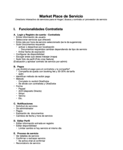
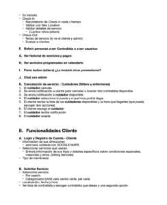
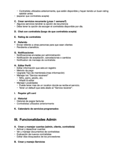
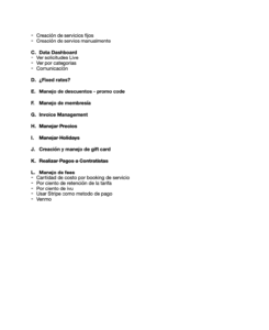
The initial stage of the project focused on defining all the necessary functionalities for the application based on insights from user research. We wanted to create an app that would meet the needs of both care providers and people looking for care services. To gather these insights, we conducted real-time feedback sessions with prospective users and providers. We listened closely to their needs, pain points, and goals to understand what they were looking for in a care services app. By doing so, we were able to identify the key functionalities that would make the application useful and valuable for our target audience.
Our goal was to create an app that provided people looking for care services with the necessary tools to manage their care needs while also centralizing all the essential features for care providers to manage their caregiving business efficiently With these insights, we were able to create a list of functionalities that would help us achieve this goal. By prioritizing these functionalities based on user feedback, we ensured that the app would be useful and user-friendly for all our users. This initial stage of defining functionalities was crucial in setting the foundation for the rest of the project, as it allowed us to create an app that met the needs of our audience.
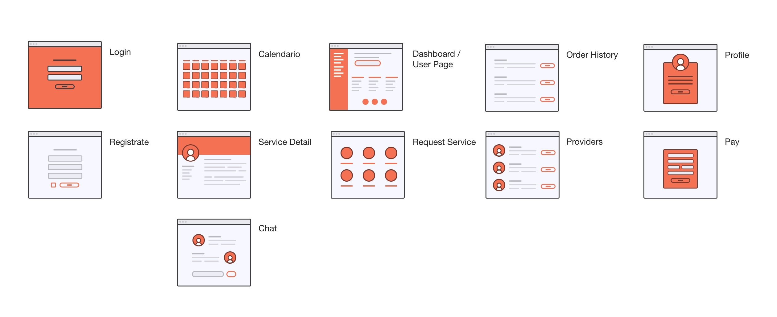
Sitemap for a macro view
Although there were variations in the screens for each user type, a general sitemap was created to understand where the features would be located on each page. This process not only helped with the understanding of the later developed backend, but also helped to identify the necessary UX/UI design requirements.
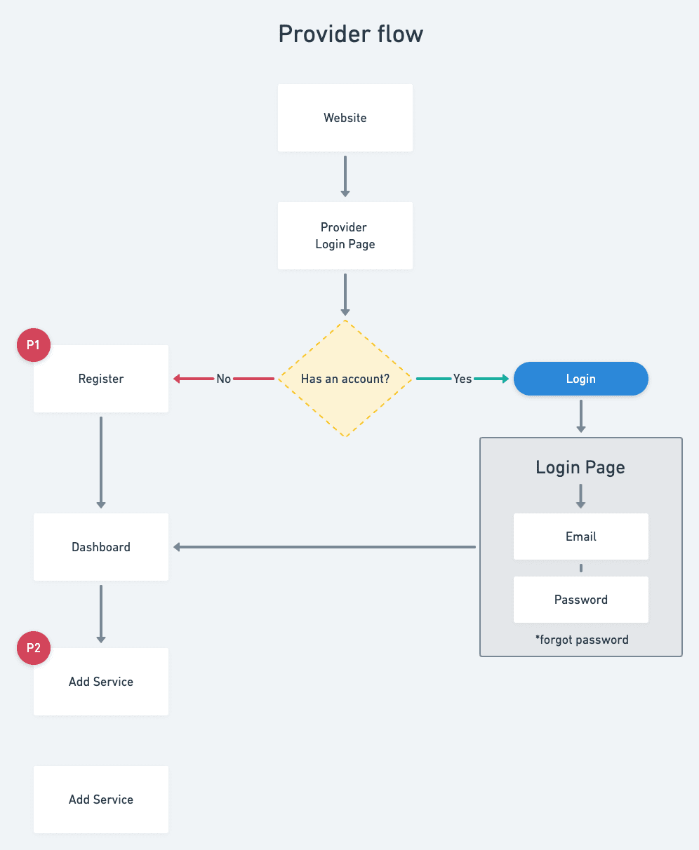
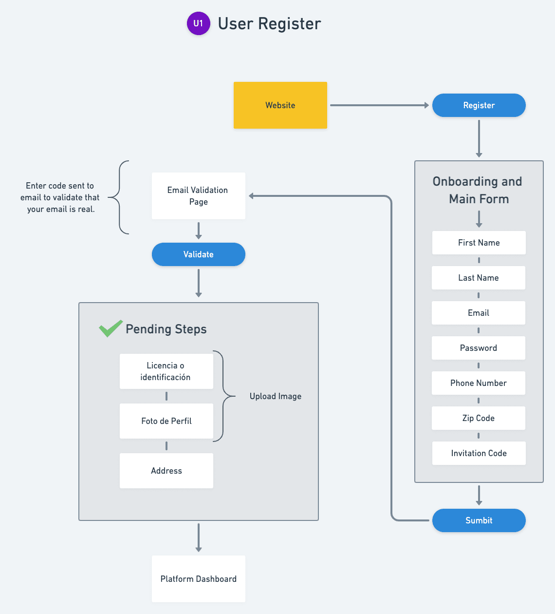
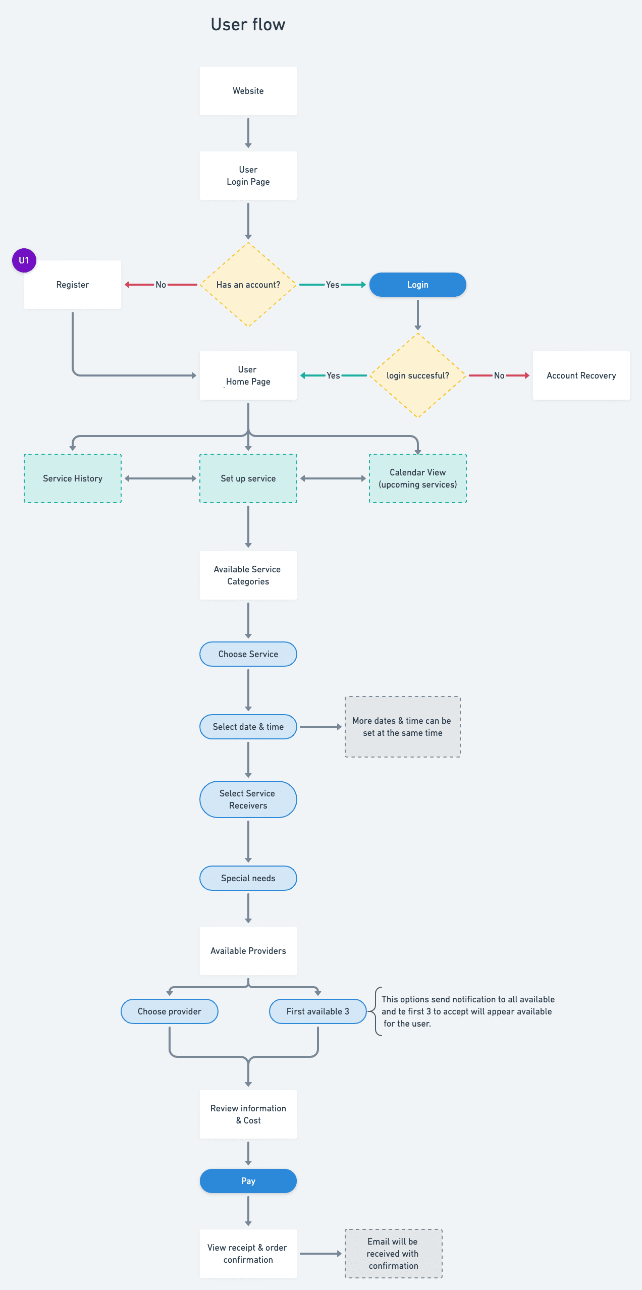
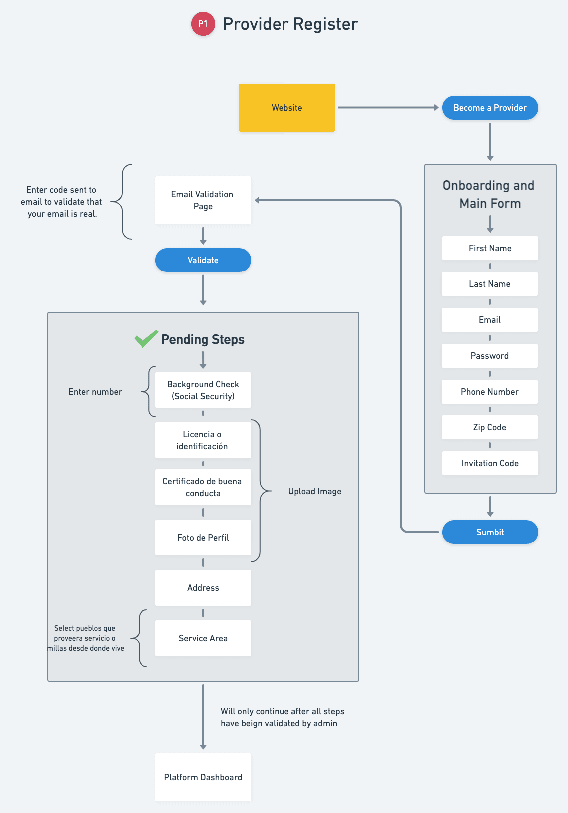
User Flow
After defining the application’s features, we developed a user flow to understand how different user types would interact with the platform. This was crucial because the booking process varied depending on the type of service offered, and the user flow helped us identify and address these differences in a user-friendly manner.
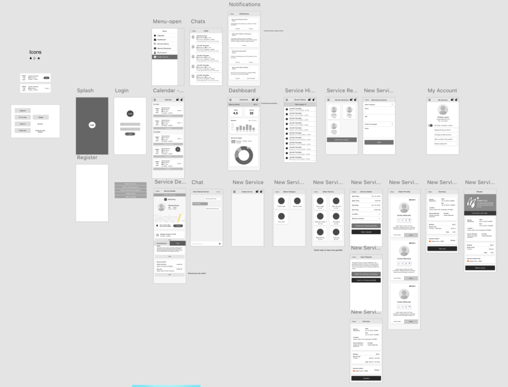
Wireframe
The wireframe/low-fidelity mockup we have created is a highly effective visual representation of the application’s features and interactions. It has been carefully designed to help us gain a deeper understanding of how the application functions and how users might interact with it, which is crucial for informing our development process.
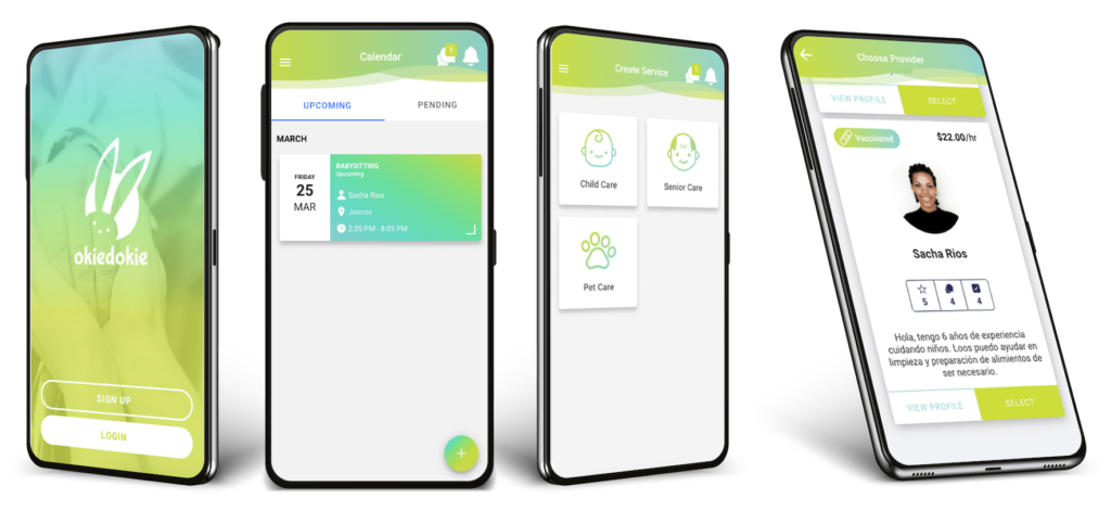
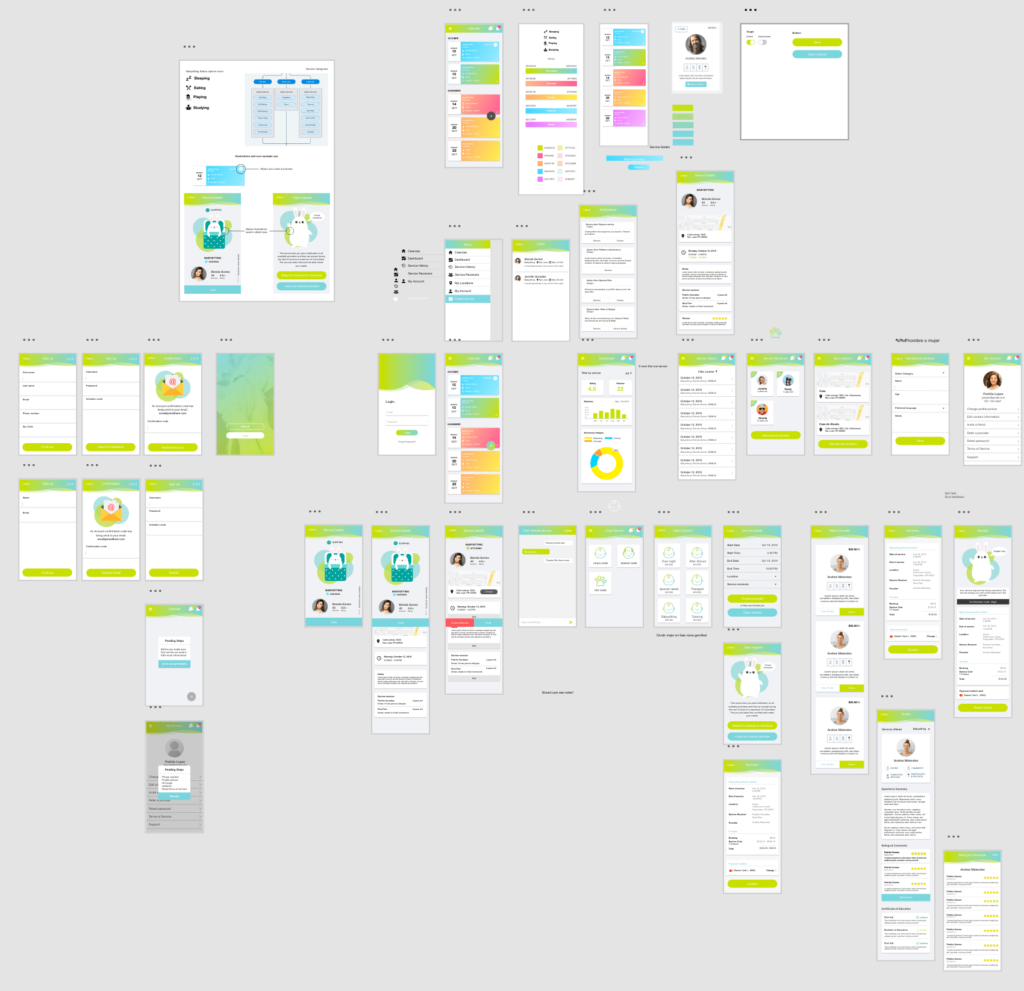
Mockup
We conducted A/B testing to refine the wireframe design and optimize the user experience. This helped identify areas for improvement, ensuring all functionalities were ready for implementation. We then created a detailed mockup for further refinement and to prepare for development, meeting user needs while maintaining high performance standards.
Results
After programming the app, we conducted additional A/B testing and closely monitored its progress and user engagement. We were pleased to see that it quickly gained traction, registering an impressive 145 providers and 156 clients within just a few months. This achievement demonstrated the effectiveness of our development process and dedication to delivering a high-quality product that meets user needs.